Fed Liquidity Template & Indicator
This indicator and chart layout is designed to show you whether “liquidity” is being injected or withdrawn from the markets. What is this “liquidity”? Since the Great Financial Crisis of 2008, we entered a new era for the markets in which the central banks have actively propped up our stock markets. They do this through a mechanism called Quantitative Easing (QE). Basically it’s the government and central banks trying to help the economy when it’s not doing well. It’s kind of like when you’re playing a video game and you need some extra coins to keep going, so you ask your parents for some help.
In the same way, when the economy is struggling, the government and central banks can inject extra money into the economy by buying things like government bonds or other assets from banks. This gives the banks more money to lend out to businesses and people, which can help boost economic activity and create more jobs. This also boosts the stock market.
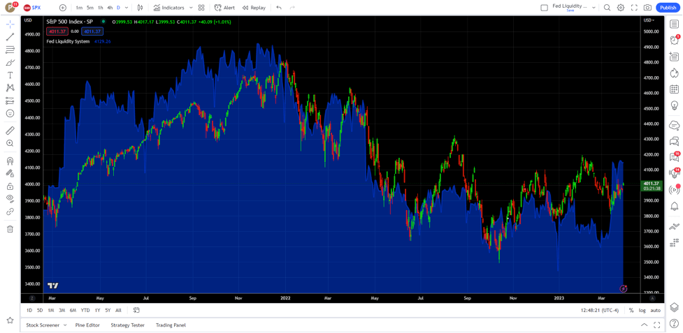
Our tool monitors the flows from this activity, and measures whether the stock market is overbought or oversold relative to these readings using our proprietary calculation. There’s three pieces to this system. On the price chart you will have an overlay of the liquidity levels that are in the system (blue shading) As you can see the stock market follows these flows.
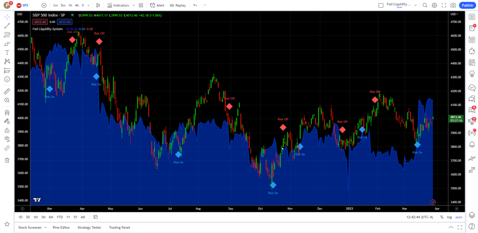
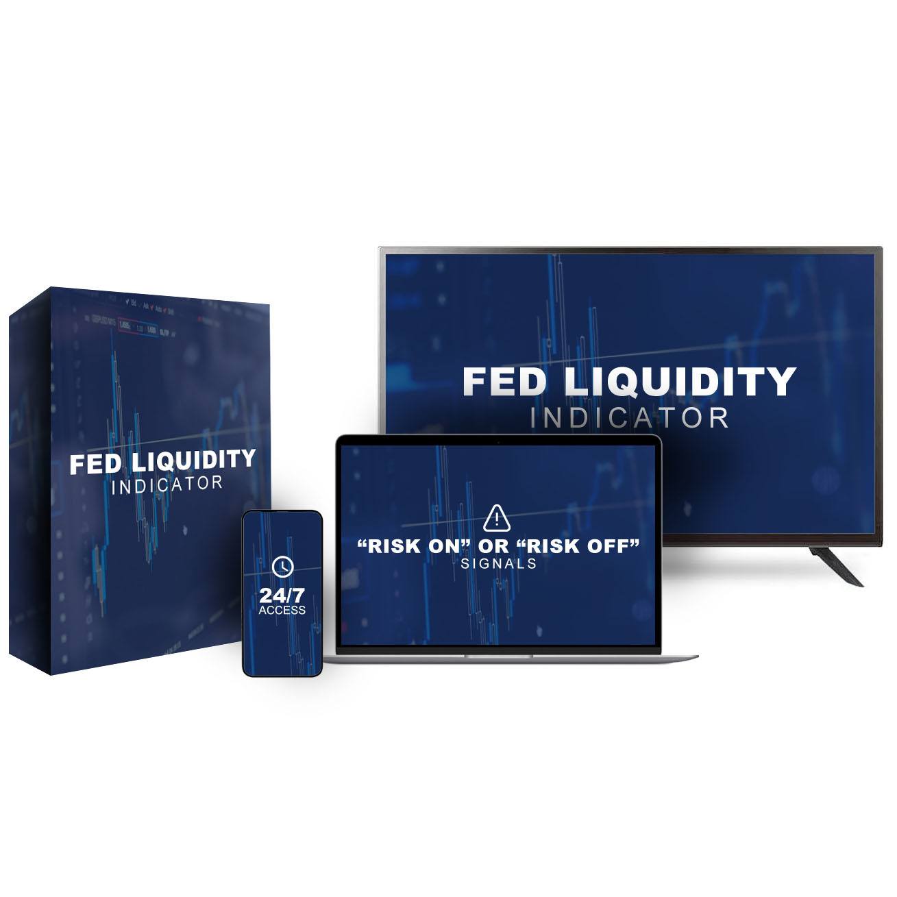
“Risk On” or “Risk Off” Signals
These are displayed on the price chart along with the blue liquidity shading. “Risk On” is a term that people use to describe a situation where investors are willing to take on more risk by investing in things that might not be very safe. It means that people are feeling confident about the economy and the stock market, so they’re more willing to take chances with their money. Conversely, “Risk off” is a term that’s used to describe a situation in which people become more cautious and less willing to take risks. It’s kind of like when you’re playing a game and you’re winning, but then you start to worry that you might lose, so you start to play more carefully and try to protect what you already have. Think of it as a sentiment indicator, so over the coming days you should expect the markets to rise or fall depending on the signal. We like to view these “Risk On” / “Risk Off” signals on the daily and Weekly time frames.
Fair Value Indicator
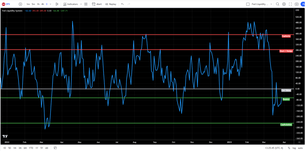
The third piece to this system is the fair value indicator. This is on the lower pane of the chart template. This line indicates how far from fair value the S&P 500 is trading at. We have several levels marked off on the lower pane. These represent overbought or oversold levels and you can use these to identify areas where price will turn.
Starting from the top in the example above:
Euphoria
This indicates that the markets are very overbought relative to the liquidity readings and we are likely going to see the stock market stop going up, drop back down in the next day or two.
Short / Hedge
This level indicates that you should look at hedging against a drop, and/ or potentially taking a short position on the stock market indices. You can combine this with other sell signals to better time an entry. It is possible for the markets to make a higher high after this reading, so consider it as a warning signal, or a take profit signal if you are in a swing trade going into these levels.
Fair Value
This is considered a neutral price level.
Bounce
We look for a short term bounce from this reading. While it can put in a longer term bottom in the markets, we treat it as a short term buy signal. You can also use it to close short positions when it hits this level.
Capitulation
This level means the markets are extremely oversold relative to the liquidity readings and typically we look for a longer term bottom in the stock markets to form from this level. Sometime sit can take a few days to form the bottom, but swing trading long from this level has a high probability of succeeding and we look for a rotation back up to fair value at minimum, or back to the euphoria for the full buy swing trade rotation.
Here you can see how fair value identifies the swing highs and lows of the S&P 500:
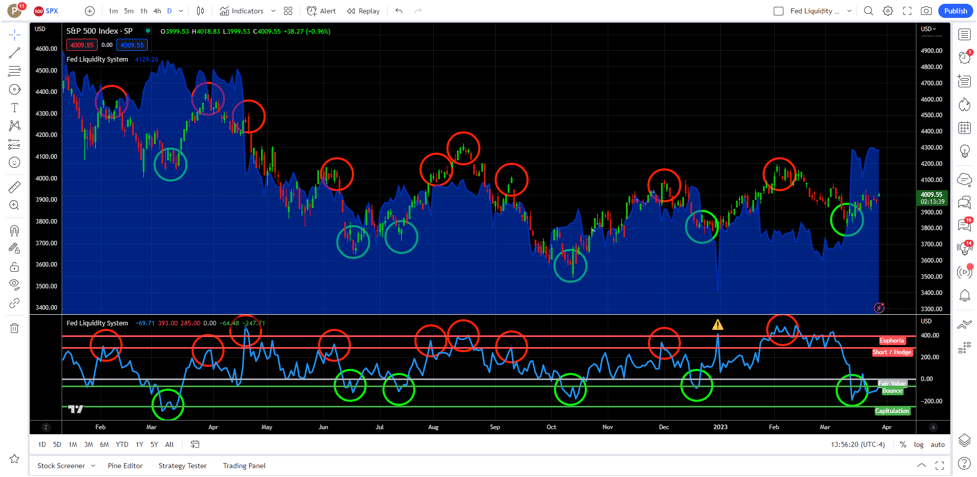
*Note: The Start of 2023 (Yellow warning symbol produced an erroneous reading due to end of year adjustments by the banks. There is typically a sharp change in the reading between the last trading day of the year and the first trading day of the year. This is normal, just keep that in mind.
What You Get:
After you sign up, you will be authorized for access to the indicator and you’ll receive an email with a chart template link to be used in TradingView (Note: This will work with a TradingView account, you will just need to remove the default chart layout as you can only store one chart layout, we’ll include a link to a video on how to do this in case you need it). Once you save it to your layouts, it will load everything you see here.
As you can see, knowing whether liquidity is rising or falling (Risk On/Off) and knowing if the market is overbought or oversold relative to the liquidity readings is a huge edge in trading/investing in these modern markets. It’s a system that we use everyday and don’t take trades without it.